
Visual Channel
6 December 2010

At the end of the 1990's I made a personal push-back against using slides in presentations, as I was tired by poorly designed bullet-points presentations. For around a decade, I gave keynotes with no slides at all. In the last year or so I've started using slides again - primarily inspired by watching my colleague Neal Ford who turns the dreaded slide-deck into a genuine enhancement to his talks (and is collaborating on a book project to pass on his techniques). As I've been working with slides again, I've also been thinking about what makes a set of slides an effective part of a talk. Thee main principle I've tried to follow is to think of them as a visual channel that complements the audio channel which is my spoken words. I find that thinking them of separate channels in this way helps me avoid common problems with presentations - many of which are rooted in the commonplace bullet point slides.
Most presentation mavens will tell you to avoid bullet point slides, but that leaves the question of what should go there. When I think of a complimentary visual channel, it makes me think of what visual elements will match my words. This means that the visual channel needs to make the same point, but in a different way.
Saying the same thing differently implies getting away from words on the slide - or at least words that take much attention to read. That's one reason why bullet point sentences are out. But I find words can work, providing they are just words not sentences.
The common approach these days for post-bullet-point presentations is to use photographs. I've derided this by saying that stock photos are the bullet points of the 21st century. By this I don't mean that photos are always wrong, but they often seem to be very unconnected with the speaker's words. Such extraneous pictures interfere with the learners ability to make sense of the material 1. I get the impression of many hours spent crawling the internet for some photo that tenuously goes with the talk. (And please, if you use photos, make sure you credit the photographer.)
1: Clark and Mayer describes empirical evidence that extraneous material results in less understanding
What I tend to use most is simple diagrams. I try to find some arrangement of simple graphics (and words) that through their visual positioning can help to illustrate, and thus better explain, my words.
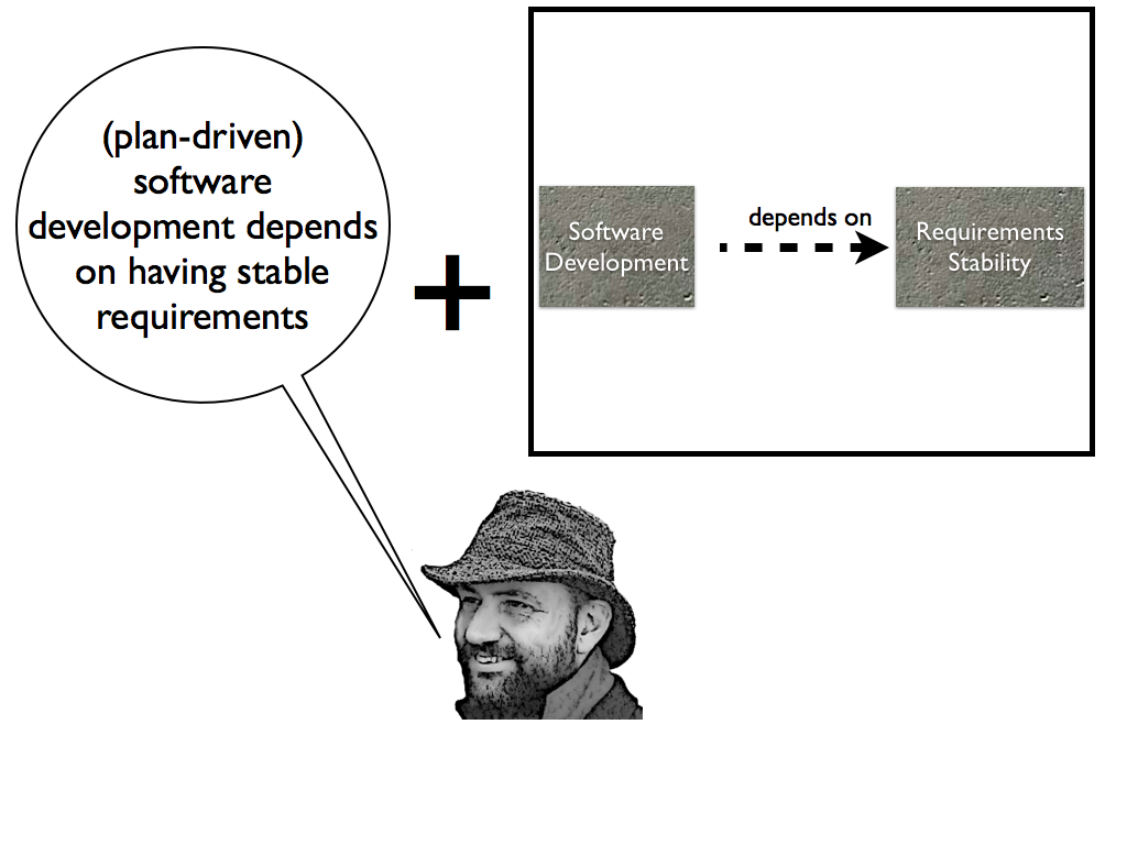
Here's a somewhat random example that I picked from my Essence of Agile talklet.
At this point in the talk I'm describing the plan-driven approach to software that the creators of agile were pushing back against. My actual words that go with slide vary depending on the day I give the talk, but they hit these points:
(In a plan driven world)
- The software development activity depends on having stable requirements
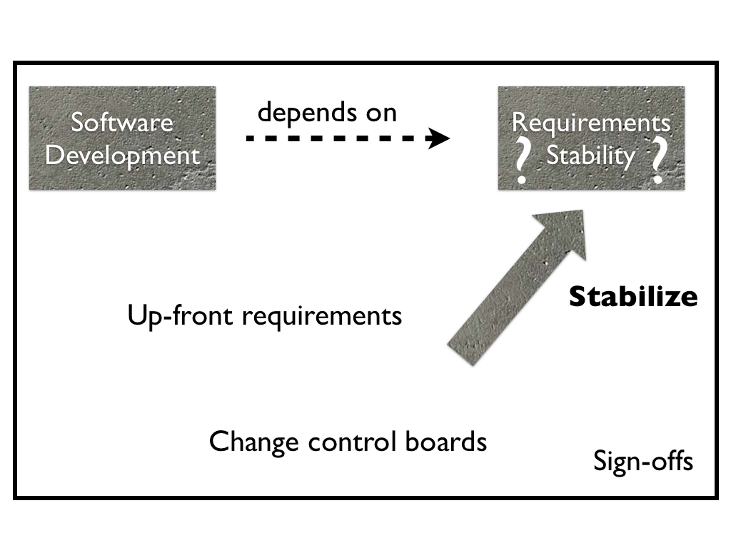
- Most of the time, the stability of requirements is questionable
- The plan-driven community knows that requirements stability is hard so explicitly seeks to stabilize them
- Stabilization techniques include up-front requirements, change control boards, and sign-offs
In my talking, I don't verbally state the techniques, instead leaving that list for the slide to illustrate. I think a list of examples is best left to the visual channel.
I've shown this slide as a single graphic, but when I give the talk the slide builds up over a sequence of slides and builds, with me timing the builds to match what I'm saying. This is an example of another aspect of my approach to the visual channel - using motion. Of course it's not uncommon for people to use animations on slides, but too often these animations are gratuitous sizzle that are there purely to show off the capabilities of the presentation software. I've no problem in using sizzle, but I try to always match an animation to what I'm saying, so that the animation can be part of that semantically rich visual channel.
An example here is what I do with the slide after this one. That slide is very similar to this one, just showing an earlier point in the build sequence (the point of software development depending on requirements stability). Most of the time I just use a simple fade to transition from one slide to another, but in this case I'm starting to discuss the agile approach to dealing with this dependency. As a result I do a fancy 3D cube rotation animation, to illustrate the point that we are changing perspectives into the agile world-view. Whenever I switch between the plan-driven and agile world-views in the talk, I do a 3D cube rotate. That transition is eye-candy, but when used this way I think it's eye-candy that helps communicate the point I'm making.
I think that since we have animation available to us when doing presentations, we should use it to enhance the visual channel, providing I can do this in a way that fulfills the role of the visual channel. That role is to keep the eyes engaged in an activity that supports my words without distracting from them.
An important consequence of this philosophy is that the slides do not make any sense without the words I'm speaking. Hence if someone asks for a copy of my slide deck, I always refuse as the slides do not make any sense on their own (and can even mislead). Trying to create slides to be used with the talk that are also handouts end up creating a Slideument: which fails at both.
Notes
1: Clark and Mayer describes empirical evidence that extraneous material results in less understanding