U Pod
11 June 2010
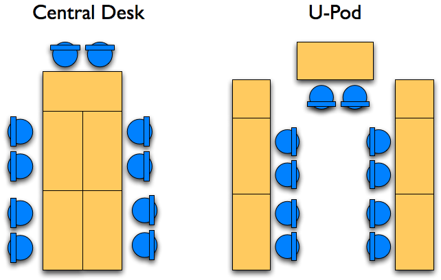
The default layout of workstations in a TeamRoom is a central desk, with everyone sitting around it. However a number of my colleagues now prefer a u-pod, with developers in the middle of a U shape of tables.

The biggest advantage of u-pods, is that they allow people to more easily wheel their chairs over to glance at another team member's monitor. They also seem to encourage more casual conversations and generally better ear contact.
My sketch shows a fairly tight U, but I've also had suggestions for a wider U with enough room inside for a small snack table, or even a central working table.
One disadvantage with u-pods is that they make it tricky to get to wall space for whiteboards and the like. This is particularly an issue if desks are placed against a wall, which otherwise is space efficient. On the whole, people I've talked find the easier inter-personal communication worth this cost.
(While I'm at it, a bit of old advice, but still valid. Don't put your monitor in a corner, as was common in the days of big CRT monitors. That way only one person can easily work at it - which is terrible both for pairing and collaboration generally.)

