
Don't Compare Averages
Using only the averages to compare groups of numbers hides many insights
In business meetings, it's common to compare groups of numbers by comparing their averages. But doing so often hides important information in the distribution of the numbers in those groups. There are a number of data visualizations that shine a light on this information. These include strip charts, histograms, density plots, box plots, and violin plots. These are easy to produce with freely available software, working on groups as small as a dozen, or as large as thousands.
24 September 2020

Imagine you're an executive, and you're asked to decide which of your sales leaders to give a big award/promotion/bonus to. Your company is a tooth-and-claw capitalist company that only considers revenue to be important, so the key element in your decision is who has got the most revenue growth this year. (Given it's 2020, maybe we sell masks.)
Here's the all-important numbers.
| name | average revenue increase (%) |
|---|---|
| alice | 5.0 |
| bob | 7.9 |
| clara | 5.0 |
And a colorful graph
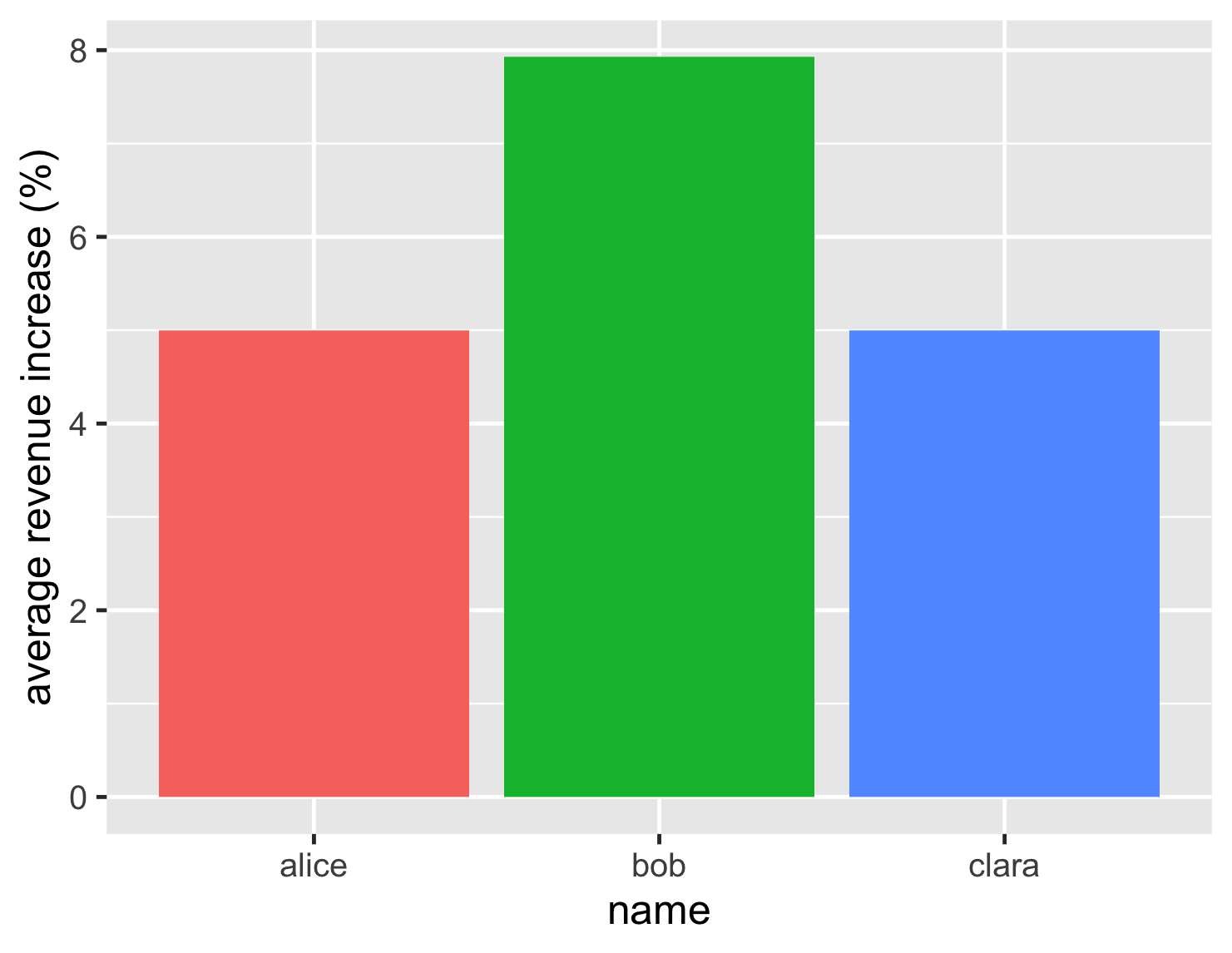
Based on this, the decision looks easy. Bob, at just under 8%, has a notably better revenue increase than his rivals who languish at 5%.
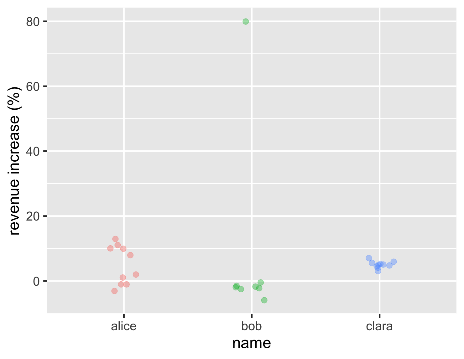
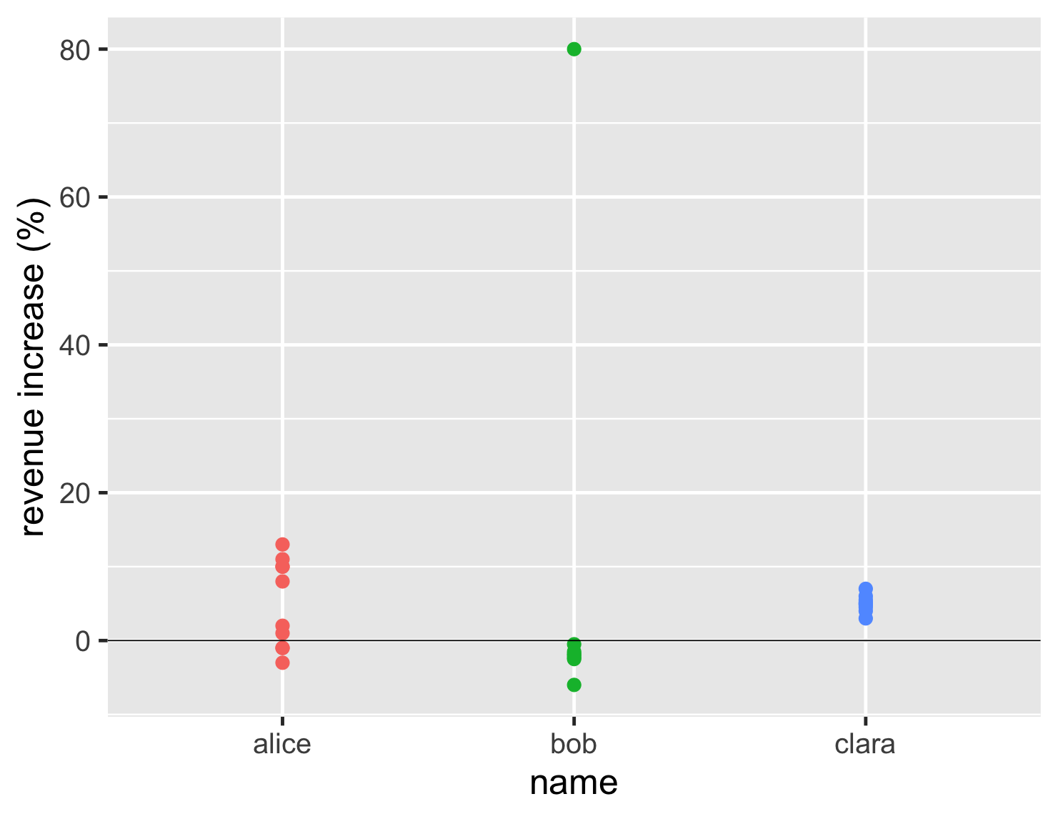
But lets dig deeper, and look at the individual accounts for each of our salespeeps.
| name | account revenue increases (%) | |||||||||
|---|---|---|---|---|---|---|---|---|---|---|
| alice | -1.0 | 2.0 | 1.0 | -3.0 | -1.0 | 10.0 | 13.0 | 8.0 | 11.0 | 10.0 |
| bob | -0.5 | -2.5 | -6.0 | -1.5 | -2.0 | -1.8 | -2.3 | 80.0 | ||
| clara | 3.0 | 7.0 | 4.5 | 5.5 | 4.8 | 5.0 | 5.2 | 4.0 | 6.0 | 5.0 |
This account-level data tells a different story. Bob's high performance is due to one account yielding a huge 80% revenue increase. All his other accounts shrank. With Bob's performance based on just one account, is he really the best salespeep for the bonus?
Bob's tale is a classic example of one the biggest problems with comparing any group of data points by looking at the average. The usual average, technically the mean, is very prone to one outlier swinging the whole value. Remember the average net worth of a hundred homeless people is $1B once Bill Gates enters the room.
The detailed account data reveals another difference. Although Alice and Clara both have the same average, their account data tells two very different stories. Alice is either very successful (~10%) or mediocre (~2%), while Clara is consistently mildly successful (~5%). Just looking at the average hides this important difference.
By this point, anyone who's studied statistics or data visualization is rolling their eyes at me being Captain Obvious. But this knowledge isn't getting transmitted to folks in the corporate world. I see bar charts comparing averages all the time in business presentations. So I decided to write this article, to show a range of visualizations that you can use to explore this kind of information, gaining insights that the average alone cannot provide. In doing this I hope I can persuade some people to stop only using averages, and to question averages when they see others doing that. After all there's no point eagerly collecting the data you need to be a data-driven enterprise unless you know how to examine that data properly.
A strip chart shows all the individual numbers
So the rule is don't compare averages when you don't know what the actual distribution of the data looks like. How can you get a good picture of the data?
I'll start with the case above, when we don't have very many data points. Often the best way to go for this is a strip chart, which will show every data point in the different populations.
show code
ggplot(sales, aes(name, d_revenue, color=name)) +
  geom_jitter(width=0.15, alpha = 0.4, size=5, show.legend=FALSE) +
  ylab(label = "revenue increase (%)") +
  geom_hline(yintercept = 0) +
  theme_grey(base_size=30)
With this chart we can now clearly see the lone high point for Bob, that most of his results are similar to Alice's worst results, and that Clara is far more consistent. This tells us far more than the earlier bar chart, but isn't really any harder to interpret.
You may then ask, how to plot this nice strip chart? Most people who want to plot some quick graphs use Excel, or some other spreadsheet. I don't know how easy it is to plot a strip chart in the average spreadsheet, as I'm not much of a spreadsheet user. Based on what I see in management presentations, it may be impossible, as I hardly ever see one. For my plotting I use R, which a frighteningly powerful statistics package, used by people who are familiar with phrases like “Kendall rank correlation coefficient” and “Mann-Whitney U test”. Despite this fearsome armory, however, it's pretty easy to dabble with the R system for simple data manipulation and graph plotting. It's developed by academics as open-source software, so you can download and use it without worrying about license costs and procurement bureaucracy. Unusually for the open-source world, it has excellent documentation and tutorials to learn how to use it. (If you're a Pythonista, there's also a fine range of Python libraries to do all these things, although I've not delved much into that territory.) If you're curious about R, I have a summary in the appendix of how I've learned what I know about it.
If you're interested in how I generate the various charts I show here, I've included a “show-code” disclosure after each chart which shows the commands to plot the chart. The sales dataframes used have two columns: name, and d_revenue.
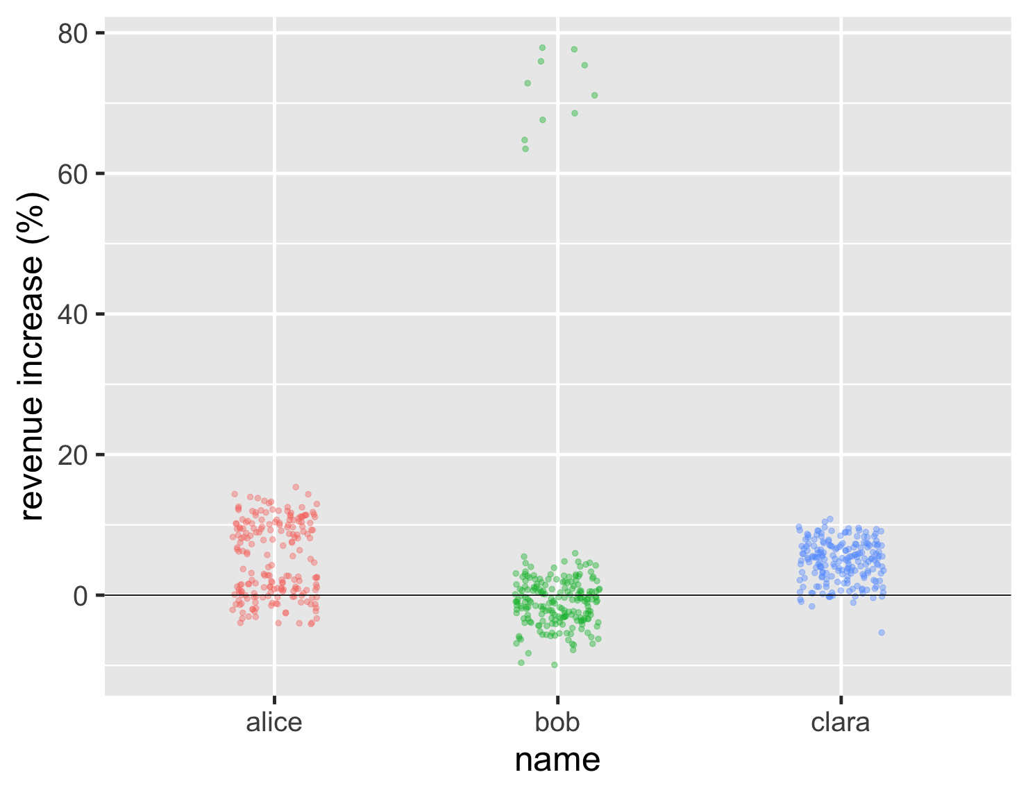
What if we have a larger number of data points to consider? Imagine our trio are now rather more important, each handling a couple of hundred accounts. Their distributions still, however show the same basic characteristics, and we can see that from a new strip chart.
show code
ggplot(large_sales, aes(name, value, color=name)) +
  geom_jitter(width=0.15, alpha = 0.4, size=2, show.legend=FALSE) +
  ylab(label = "revenue increase (%)") +
  geom_hline(yintercept = 0) +
  theme_grey(base_size=30)
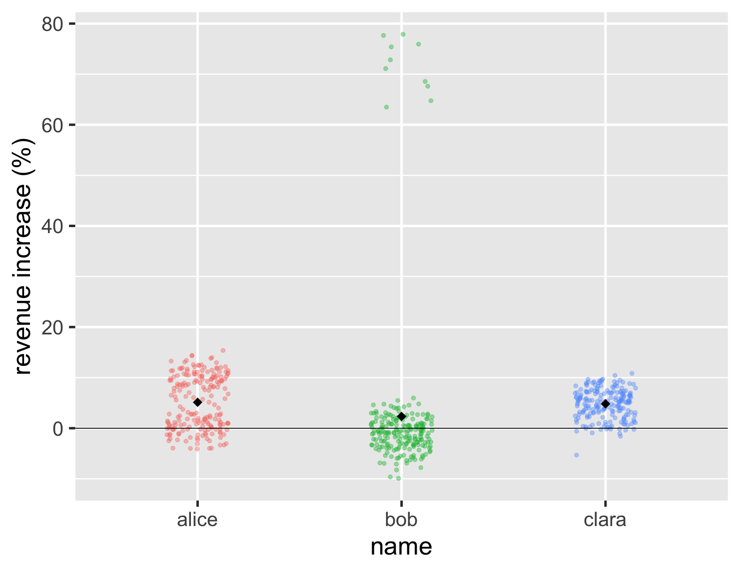
One problem with the strip chart, however, is that we can't see the average. So we can't tell whether Bob's high values are enough to compensate for this general lower points. I can deal with this by plotting the mean point on the graph, in this case as a black diamond.
show code
ggplot(large_sales, aes(name, value, color=name)) +
  geom_jitter(width=0.15, alpha = 0.4, size=2, show.legend=FALSE) +
  ylab(label = "revenue increase (%)") +
  geom_hline(yintercept = 0) +
  stat_summary(fun = "mean", size = 5, geom = "point", shape=18, color = 'black') +
  theme_grey(base_size=30)
So in this case Bob's mean is a bit less than the other two.
This shows that, even though I often disparage those who use means to compare groups, I don't think means are useless. My disdain is for those who only use means, or use them without examining the overall distribution. Some kind of average is often a useful element of a comparison, but more often than not, the median is actually the better central point to use since it holds up better to big outliers like Bob's. Whenever you see an “average”, you should always consider which is better: median or mean?
Often the reason median is such an under-used function is because our tooling doesn't encourage us to use it. SQL, the dominant database query language, comes with a built-in AVG function that computes the mean. If you want the median, however, you're usually doomed to googling some rather ugly algorithms, unless your database has the ability to load extension functions. 1 If some day I become supreme leader, I will decree that no platform can have a mean function unless they also supply a median.
1: I've made good use of SQLite's extension-functions contributed file, which has a bunch of useful functions, including median.
Using histograms to see the shape of a distribution
While using a strip chart is a good way to get an immediate sense of what the data looks like, other charts can help us compare them in different ways. One thing I notice is that many people want to use The One Chart to show a particular set of data. But every kind of chart illuminates different features of a dataset, and it's wise to use several to get a sense of what the data may be telling us. Certainly this is true when I'm exploring data, trying to get a sense of what it's telling me. But even when it comes to communicating data, I'll use several charts so my readers can see different aspects of what the data is saying.
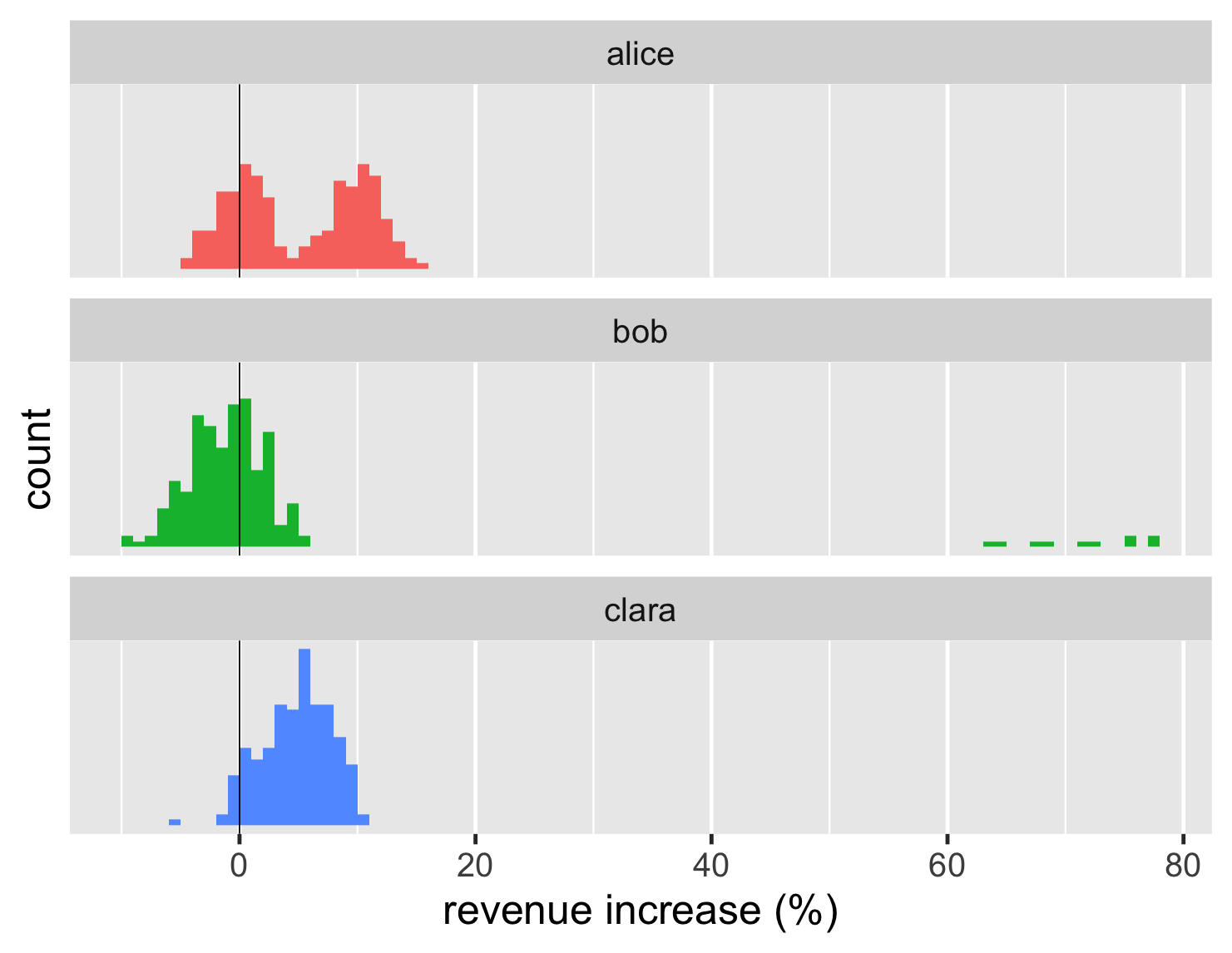
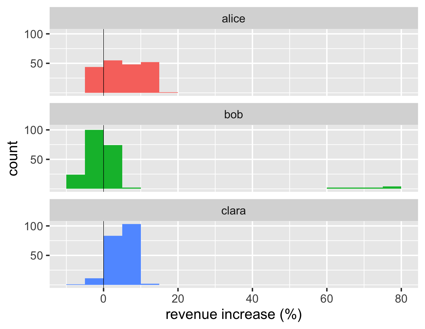
The histogram is a classic way of looking at a distribution. Here are histograms for the large dataset.
show code
ggplot(large_sales, aes(value, fill=name)) +
  geom_histogram(binwidth = 1, boundary=0, show.legend=FALSE) +
  xlab(label = "revenue increase (%)") +
  scale_y_continuous(breaks = c(50,100)) +
  geom_vline(xintercept = 0) +
  theme_grey(base_size=30) +
 facet_wrap(~ name,ncol=1)
Histograms work really well at showing the shape of a single distribution. So it's easy to see that Alice's deals clump into two distinct blocks, while Clara's have a single block. Those shapes are somewhat easy to see from the strip chart too, but the histogram clarifies the shape.
A histogram shows only one group, but here I've shown several together to do the comparison. R has a special feature for this, which it refers to as faceted plots. These kind of “small multiples” (a term coined by Edward Tufte) can be very handy for comparisons. Fortunately R makes them easy to plot.
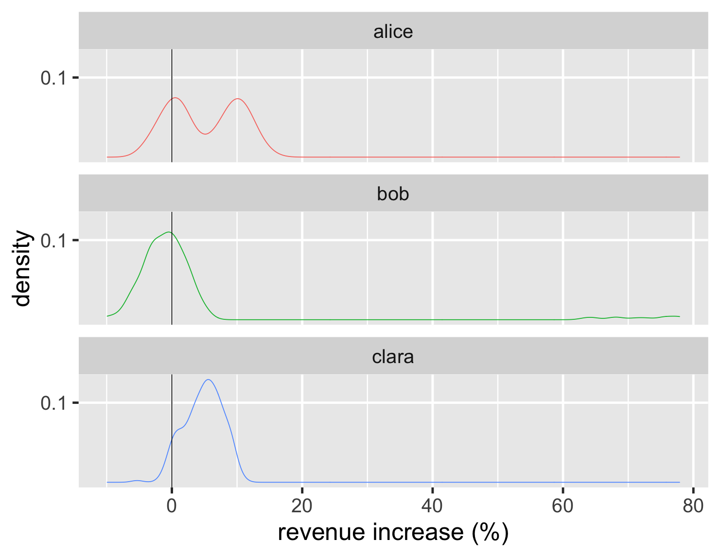
Another way to visualize the shapes of the distributions is a density plot, which I think of as a smooth curve of a histogram.
show code
ggplot(large_sales, aes(value, color=name)) +
  geom_density(show.legend=FALSE) +
  geom_vline(xintercept = 0) +
  xlab(label = "revenue increase (%)") +
  scale_y_continuous(breaks = c(0.1)) +
  theme_grey(base_size=30) +
  facet_wrap(~ name,ncol=1)
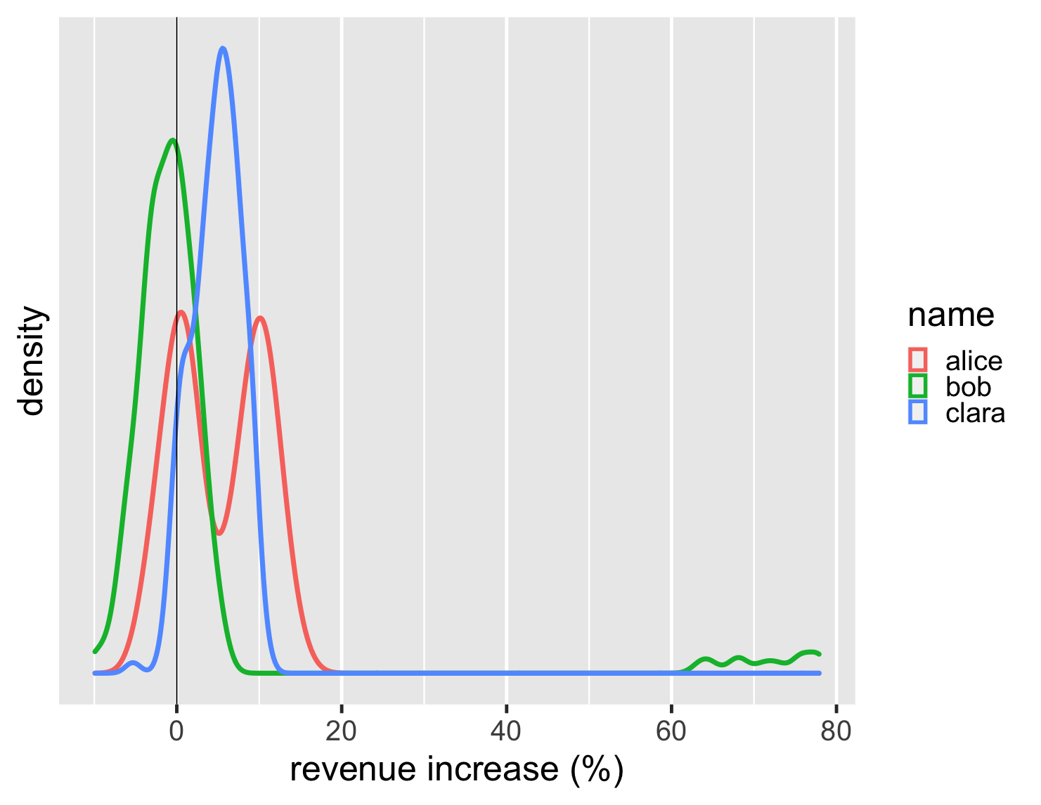
The density scale on the y axis isn't very meaningful to me, so I tend to remove that scale from the plot - after all the key element of these are shapes of the distributions. In addition, since the density plot is easy to render as a line, I can plot all of them on a single graph.
show code
ggplot(large_sales, aes(value, color=name)) +
  geom_density(size=2) +
  scale_y_continuous(breaks = NULL) +
  xlab(label = "revenue increase (%)") +
  geom_vline(xintercept = 0) +
  theme_grey(base_size=30)
Histograms and density plots are more effective when there are more data points, they aren't so helpful when there's only a handful (as with the first example). A bar chart of counts is useful when there are only a few values, such as the 5-star ratings on review sites. A few years ago Amazon added such a chart for its reviews, which show the distribution in addition to the average score.
Boxplots work well with many comparisons
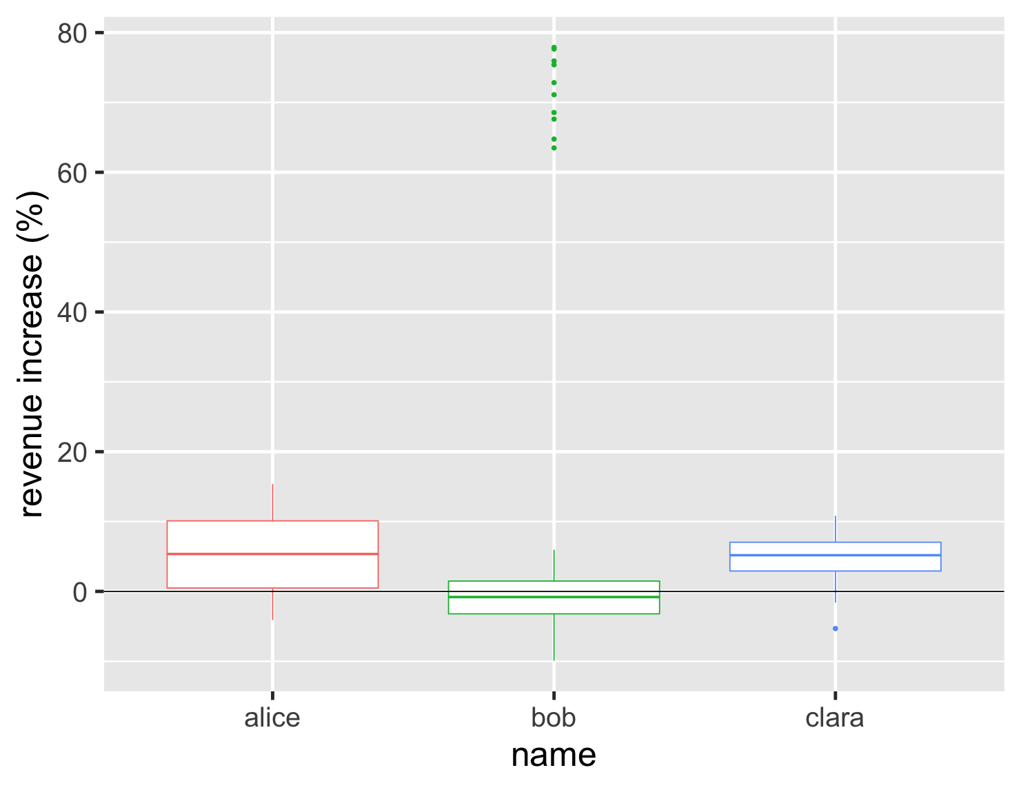
Histograms and density plots are a good way to compare different shapes of distributions, but once I get beyond a handful of graphs then they become difficult to compare. It's also useful to get a sense of commonly defined ranges and positions within the distribution. This is where the boxplot comes in handy.
show code
ggplot(large_sales, aes(name, value, color=name)) +
  geom_boxplot(show.legend=FALSE) +
  ylab(label = "revenue increase (%)") +
  geom_hline(yintercept = 0) +
  theme_grey(base_size=30)
The box plot focuses our attention on the middle range of the data, so that half the data points are within the box. Looking at the graph we can see more than half of Bob's accounts shrank and that his upper quartile is below Clara's lower quartile. We also see his cluster of hot accounts at the upper end of the graph.
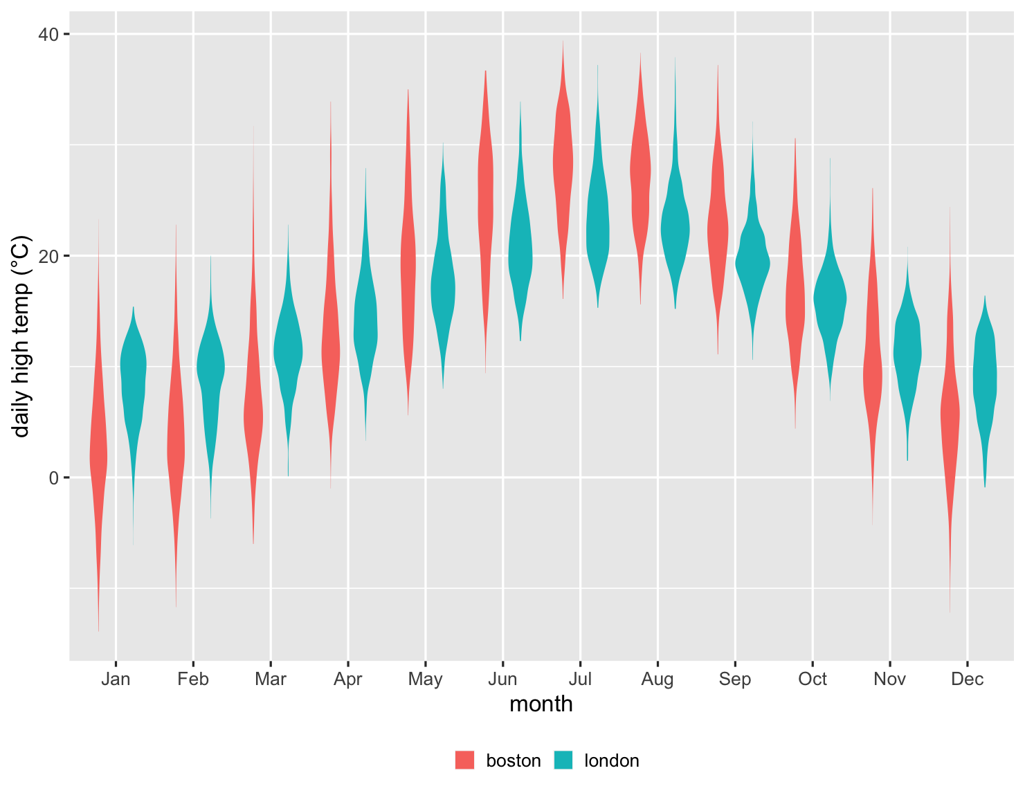
The box plot works nicely with a couple of dozen items to compare, providing a good summary of what the underlying data looks like. Here's an example of this. I moved to London in 1983 and moved to Boston a decade later. Being British, I naturally think about how the weather compares in the two cities. So here is a chart showing comparing their daily high temperatures each month since 1983.
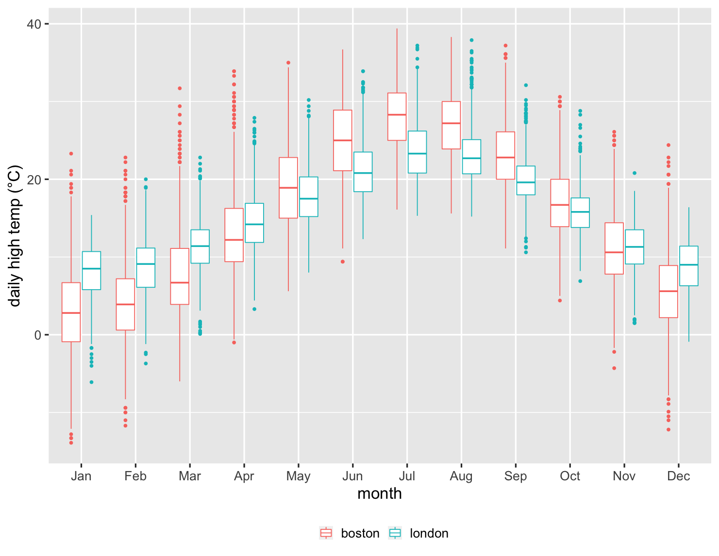
show code
ggplot(temps, aes(month, high_temp, color=factor(city))) +
  ylab(label = "daily high temp (°C)") +
  theme_grey(base_size=20) +
  scale_x_discrete(labels=month.abb) +
  labs(color = NULL) +
  theme(legend.position = "bottom") +
  geom_boxplot()
This is an impressive chart, since it summarizes over 27,000 data points. I can see how the median temperatures are warmer in London during the winter, but cooler in the summer. But I can also see how the variations in each month compare. I can see that over a quarter of the time, Boston doesn't get over freezing in January. Boston's upper quartile is barely over London's lower quartile, clearly indicating how much colder it is in my new home. But I can also see there are occasions when Boston can be warmer in January than London ever is during that winter month.
The box plot does have a weakness, however, in that we can't see the exact shape of the data, just the commonly defined aggregate points. This may be an issue when comparing Alice and Clara, since we don't see the double-peak in Alice's distribution in the way that we do with histogram and density chart.
There are a couple of ways around this. One is that I can easily combine the box plot with the strip chart.
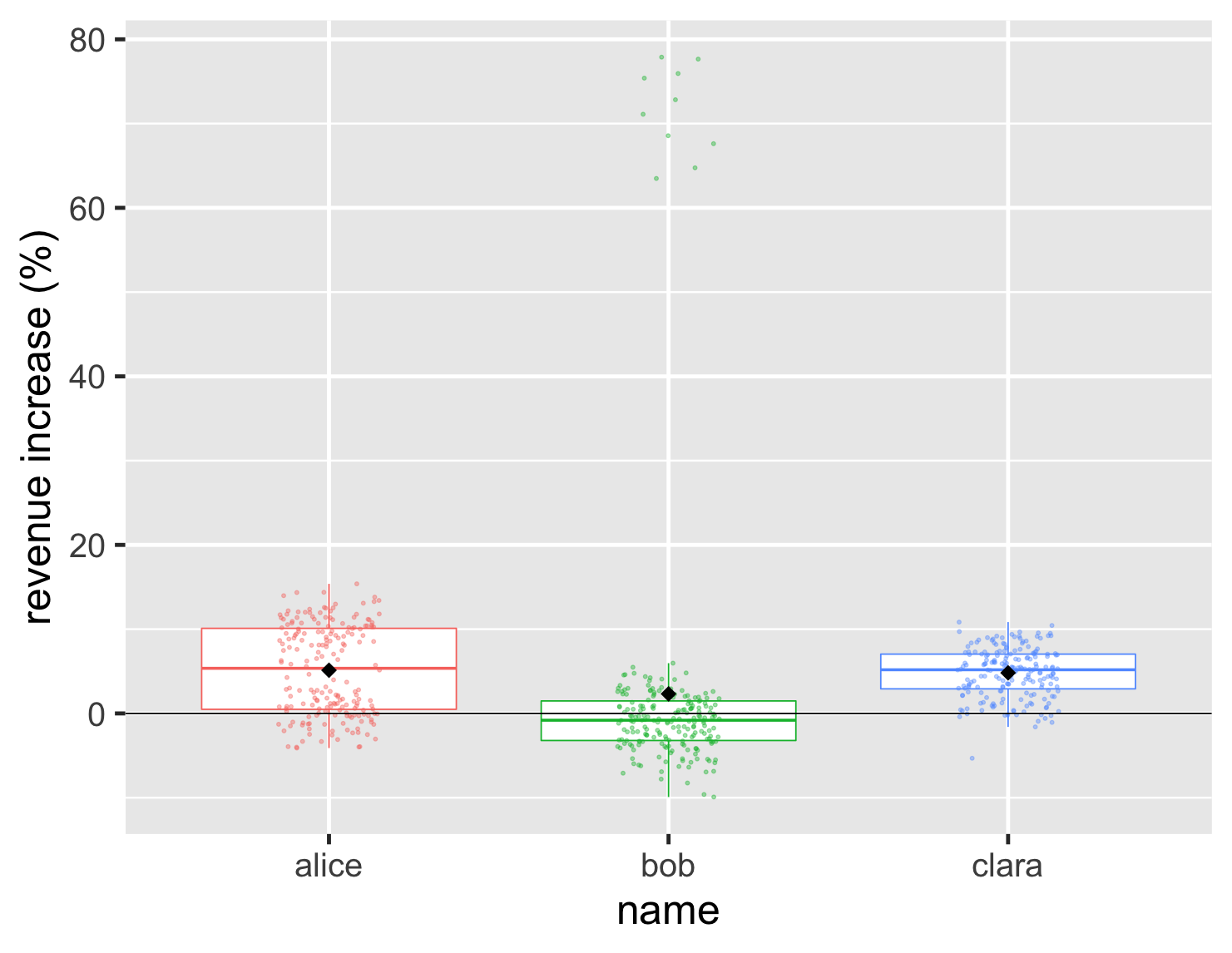
show code
ggplot(large_sales, aes(name, value, color=name)) +
  geom_boxplot(show.legend=FALSE, outlier.shape = NA) +
  geom_jitter(width=0.15, alpha = 0.4, size=1, show.legend=FALSE) +
  ylab(label = "revenue increase (%)") +
  stat_summary(fun = "mean", size = 5, geom = "point", shape=18, color = 'black') +
  geom_hline(yintercept = 0) +
  theme_grey(base_size=30)
This allows me to show both the underlying data, and the important aggregate values. In this plot I also included the black diamond that I used before to show the position of the mean. This is a good way to highlight cases like Bob where the mean and median are quite different.
Another approach is the violin plot, which draws a density plot into the sides of the boxes.
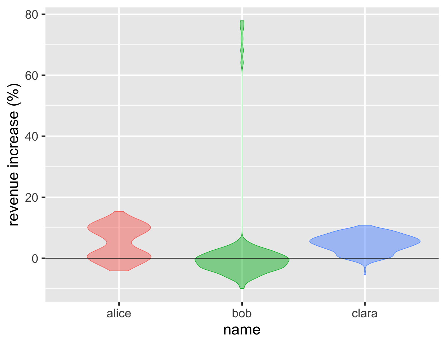
show code
ggplot(large_sales, aes(name, value, color=name, fill=name)) +
  geom_violin(show.legend=FALSE, alpha = 0.5) +
  ylab(label = "revenue increase (%)") +
  geom_hline(yintercept = 0) +
  theme_grey(base_size=30)
This has the advantage of showing the shape of the distribution clearly, so the double peak of Alice's performance stands right out. As with density plots, they only become effective with a larger number of points. For the sales example, I think I'd rather see the points in the box, but the trade-off changes if we have 27,000 temperature measurements.
show code
ggplot(temps, aes(month, high_temp, fill=factor(city))) +
  ylab(label = "daily high temp (°C)") +
  theme_grey(base_size=20) +
  labs(fill = NULL) +
  scale_x_discrete(labels=month.abb) +
  theme(legend.position = "bottom") +
  geom_violin(color = NA)
Here we can see that the violins do a great job of showing the shapes of the data for each month. But overall I find the box chart of this data more useful. It's often easier to compare by using significant signposts in the data, such as the medians and quartiles. This is another case where multiple plots play a role, at least while exploring the data. The box plot is usually the most useful, but it's worth at least a glance at a violin plot, just to see if reveals some quirky shape.
Summing Up
- Don't use just an average to compare groups unless you understand the underlying distribution.
- If someone shows you data with just an average ask: “what does the distribution look like?”
- If you're exploring how groups compare, use several different plots to explore their shape and how best to compare them.
- If asked for an “average”, check whether a mean or median is better.
- When presenting differences between groups, consider at least the charts I've shown here, don't be afraid to use more than one, and pick those that best illustrate the important features.
- above all: plot the distribution!
Acknowledgments
Adriano Domeniconi, David Colls, David Johnston, James Gregory, John Kordyback, Julie Woods-Moss, Kevin Yeung, Mackenzie Kordyback, Marco Valtas, Ned Letcher, Pat Sarnacke, Saravanakumar Saminathan, Tiago Griffo, and Xiao Guo commented on drafts of this article on internal mailing lists.
Further reading
Cédric Scherer introduces the approach of Raincloud Plots which combine features of box plots, violin plots, and strip charts in a compact notation. His tutorial is based on a paper by Allen et al
My experience learning R
I first came across R about 15 years ago, when I did a little work with a colleague on a statistical problem. Although I did a lot of maths in school, I shied away from statistics. While I was very interested in the insights it offers, I was deterred by the amount of calculation it required. I have this odd characteristic that I was good at maths but not good at arithmetic.
I liked R, particularly since it supported charts that were hardly available elsewhere (and I've never much liked using spreadsheets). But R is a platform with neighborhoods dodgy enough to make JavaScript seem safe. In recent years, however, working with R has become much easier due to the work of Hadley Whickham - the Baron Haussmann of R. He's led the development of the “tidyverse”: a series of libraries that make R very easy to work with. All the plots in this article use his ggplot2 library.
In recent years I've used R more and more for creating any reports that make use of quantitative data, using R as much for the calculations as for the plots. Here the tidyverse dplyr library plays a big role. Essentially it allows me to form pipelines of operations on tabular data. At one level it's a collection pipeline on the rows of the table, with functions to map and filter the rows. It then goes further by supporting table-oriented operations such as joins and pivots.
If writing such excellent software isn't enough, he's also co-written an excellent book to learn to use R: R for Data Science. I've found this to be a great tutorial on data analytics, an introduction to the tidyverse, and a frequent reference. If you're at all interested in manipulating and visualizing data, and like to get hands-on with a serious tool for the job, then this book is a great way to go. The R community has done a great job with this and other books that help explain both the concepts and tools of data science. The tidyverse community has also built a first-rate open-source editing and development environment called R Studio. I shall say no more that when working with R, I usually use it over Emacs.
R certainly isn't perfect. As a programming language it's shockingly quirky, and I've dared not stray from the tree-lined boulevards of simple dplyr/ggplot2 pipelines. If I wanted to do serious programming in a data-rich environment, I'd seriously consider switching to Python. But for the kinds of data work I do, R's tidyverse has proven to be an excellent tool.
Tricks for a good strip chart
There's a couple of useful tricks that I often reach for when I use a strip chart. Often you have data points with similar, or even the same values. If I plot them naively, I end up with a strip chart like this.
show code
ggplot(sales, aes(name, d_revenue, color=name)) +
  geom_point(size=5, show.legend=FALSE) +
  ylab(label = "revenue increase (%)") +
  geom_hline(yintercept = 0) +
  theme_gray(base_size=30)
This plot is still better than that first bar chart, as it clearly indicates how Bob's outlier is different to his usual performance. But with Clara having so many similar values, they all clump on top of each other, so you can't see how many there are.
The first of my tricks I use is to add some jitter. This adds some random horizontal movement to the points of the strip chart, which allows them to spread out and be distinguished. My second is to make the points partly transparent, so we can see when they plot on top of each other. With these two tricks, we can properly appreciate the number and position of the data points.
Exploring the bin width for histograms
A histogram works by putting the data into bins. So if I have a bin width of 1%, then all accounts whose revenue increase is between 0 and 1% are put into the same bin, and the graph plots how many are in each bin. Consequently the width (or amount) of bins makes a big difference to what we see. If I make larger bins for this dataset, I get this plot.
show code
ggplot(large_sales, aes(value, fill=name)) +
  geom_histogram(binwidth = 5, boundary=0,show.legend=FALSE) +
  scale_y_continuous(breaks = c(50,100)) +
  xlab(label = "revenue increase (%)") +
  geom_vline(xintercept = 0) +
  theme_grey(base_size=30) +
  facet_wrap(~ name,ncol=1)
Here the bins are so wide that we can't see the two peaks of Alice's distribution.
The opposite problem is that if the bins are too narrow the plot becomes noisy. So when I plot a histogram, I experiment with the bin width, trying different values to see which ones help expose the interesting features of the data.
Footnotes
1: I've made good use of SQLite's extension-functions contributed file, which has a bunch of useful functions, including median.
Significant Revisions
24 September 2020: published
18 September 2020: started drafting