
Muted spaghetti line charts with R's ggplot2

12 April 2021
If someone tells me their sales last month was $10M - what do I make of it? With just the bare number, I don't know what to think. To make sense of the number I need context, perhaps over time, perhaps compared to compatible companies. Using a data visualization can help me put a number into a context that allows me to make sense of it.
One particularly useful form of context is context over time. How does today's figure match up with that value over time? A line chart, plotted against time, helps me see this.
Here is a rather more sombre example than sales revenues, the deaths per 100,000 due to covid in the state of Massachusetts.
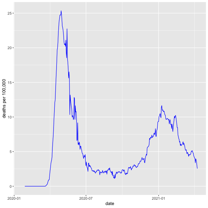
This is valuable, as I can now put today's figure in historical context, comparing recent figures to those in the last two peaks. It's also very easy to plot this chart in R, needing just a few lines of code.
death_pp %>%
    filter(state == "MA") %>%
    ggplot(aes(date, death_pm_rm)) +
    labs(y = "deaths per 100,000") +
    geom_line(color = "blue")
show code to load death_pp
# cdc covid data records New York City seperately from New York state
cdc_pops <- pops %>%
  mutate(pop = if_else(state == "NY", pop - 8400000, pop)) %>%
    add_row(name = "New York City", state = "NYC", pop = 8400000)

# http  -d "https://data.cdc.gov/api/views/9mfq-cb36/rows.csv" > cdc_cases.csv
cdc_cases <- read_csv("cdc_cases.csv") %>%
    select(state, submission_date, new_death, tot_death) %>%
    mutate(date = mdy(submission_date)) %>%
    arrange(date) %>%
    group_by(state)

death_pp <- cdc_cases %>%
  left_join(cdc_pops, by = "state") %>%
  drop_na(pop) %>%
  mutate(death_pm = new_death * 1000000 / pop) %>%
  mutate(death_pm_rm = rollmean(death_pm, 7, fill=NA, align="right"))
But I can show more context than just time. To better understand how the epidemic has been in Massachusetts, I can compare it to how things have gone in the other states. A good way to do this is to show the line chart for every other US state as a muted background.
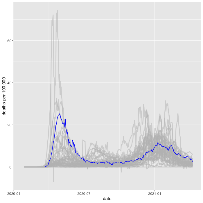
As far as I can tell, there's no generally accepted term for this kind of plot. Putting multiple lines on a line chart is sometimes referred to as a spaghetti line chart. So I'll refer to this as a muted-spaghetti chart.
In R it's pretty easy to plot this, the key is to plot another geom_line
with a different data source as the primary line we're looking at.
death_pp %>%
    filter(state == "MA") %>%
    ggplot(aes(date, death_pm_rm)) +
    labs(y = "deaths per 100,000") +
    geom_line(data = death_pp, aes(group = state), color = "grey", size = 1, alpha = 0.5) +
    geom_line(aes(y = death_pm_rm), color = "blue")
Note that I plot the background before the foreground line to ensure the foreground line pops clearly on top.
Doing this with a grid (facets)
Showing this with one state is good, but it's often useful to be able
to look at several states in this way. ggplot2 provides the very nifty
facet_wrap command to plot a line chart for every value in a set, but it
requires a little trickery to make it work with a muted-spaghetti
background like this.
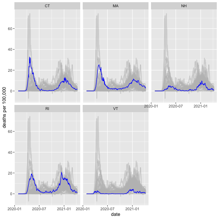
The trickery comes with the way I need to specify the grouping for the spaghetti.
death_pp %>%
  filter(state %in% c("MA", "VT", "CT", "RI", "NH")) %>%
  ggplot(aes(date, death_pm_rm)) +
  labs(y = "deaths per 100,000") +
  geom_line(data = death_pp %>% rename(s = state),
              aes(group = s), color = "grey", size = 1, alpha = 0.5) +
  geom_line(color = "blue") +
  facet_wrap(~state, ncol = 3)
By renaming the grouping column, ggplot only facets the primary line and plots the spaghetti on each facet. 1
1: It took me ages of experimenting and web searching to find how to do this with facets. Eventually I found the answer at from data to viz
Footnotes
1: It took me ages of experimenting and web searching to find how to do this with facets. Eventually I found the answer at from data to viz